
Pour Over Profit
A new app designed for shift swaps and scheduling for baristas.
A peek at the final product


Stakeholder Interview
First, I met with the stakeholder to find out the intention of the app and the most important goals.
The questions I asked were:
What is the goal for the project?
What does success look like for the project?
What are the short and long-term goals for the project?
What concerns do you have about the project?
Are there any technological limitations?
From the interview, I was able to begin working on a problem statement to focus on the overall goal of the project.
Problem Statement
Developing an application designed specifically for baristas to find available shifts at nearby cafes faces certain challenges. The app aims to enhance work opportunities for baristas while fostering a sense of community. Key issues will be addressing payment processing, fee structures, and the selection of shift assignments.

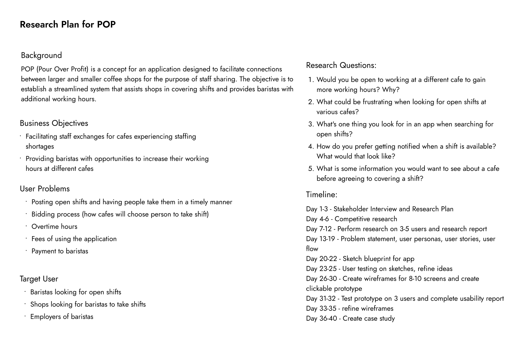
Research Plan
I created a research plan based on the stakeholder interview to validate the goals of the project and start thinking about how I should begin research. I also created a timeline in order to stay on track.
Competitive Analysis
In the process of creating the competitive analysis, I was able to gain insights into which features are considered most important by users. This analysis gave me ideas on how our app could differentiate itself and provide a unique user experience.

Research
Next, I created a survey to determine which features are most important for users. I asked my coworkers to anonymously complete the questions because they are the target audience, and wanted them to answer honestly. I asked open-ended questions that would allow them to speak more about their ideas and get more information.
Survey

1. Would you be open to working at a different cafe to gain more working hours? Why?
2. What could be confusing when looking for open shifts at various cafes?
3. What is one thing you look for in an app when searching for open shifts?
4. How do you prefer getting notified when a shift is available? What would that look like?
5. What is some information you would want to see about a cafe before agreeing to cover a shift?
Open Card Sort

“Yes, I need more hours to be successful”
“Hours of operation and location of the cafe”
“I am looking for bold obvious text signifying what shifts are open and what store they are at. Text that is different than the majority font”
“Notification via app”
“How many people are already working, if there are less people working than usual, and what their peak hours are during the shift”
After analyzing the survey, I created an open card sort to gain insights into how users categorize and label items.
The cards said words like “shifts, account, employers, schedule” to figure out how to organize each element in the app.
I used the responses to determine the most effective wording, as reflected in components such as the navigation bar.
Personas
I created three distinct personas; Two representing baristas and one for employers to effectively address the needs of both user groups within the app.


User Stories
I wrote two user stories that focus on the key elements for both baristas and their employers, allowing me to prioritize the most important features first.


User Journey
In making a user journey, I was able to gain insight into the emotions a typical user might feel when using the app. This process made me think more about what is most important for users.

User Flow
Making these user flows helped me to better understand the app's features and how both baristas and employers will use it. The app should be smooth, easy to use, and clear. This understanding guides my approach to the early design stages.

Barista Flow

Employer Flow
Lofi Wireframes
I started creating the initial blueprint for the low-fidelity designs of the app, laying down the fundamental ideas and concepts that would guide its development.


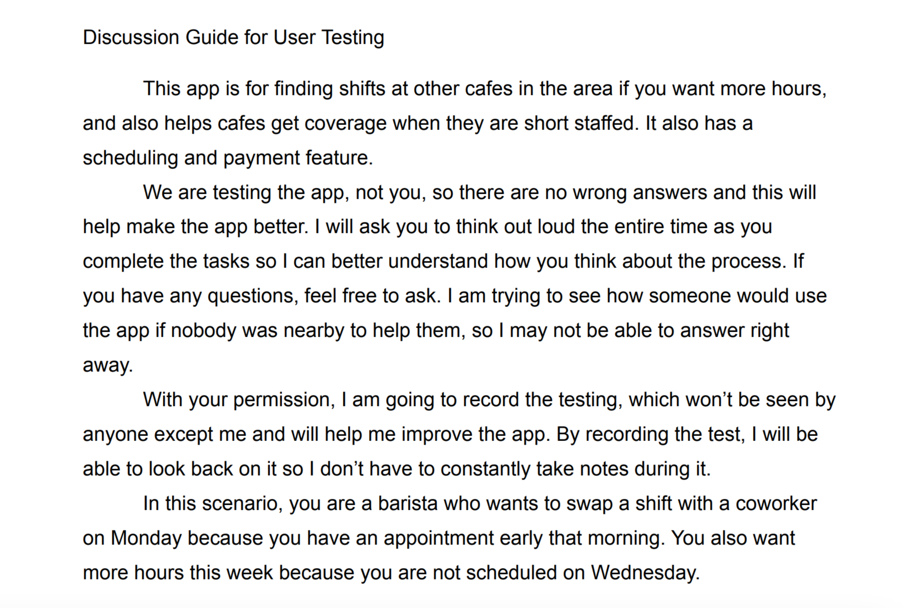
User Testing
After designing the basic wireframes, I completed some user testing on my family members in order to validate the design and make sure everything was easy to understand. I recorded them completing the tasks so that I wouldn’t have to take notes and could easily access it again.
Task 1: Swap your 8am - 4pm shift with the 11am - 7pm shift on March 17th
Task 2: Look for an open shift on Wednesday, March 19th and place a bid
Task 3: Change the schedule to “list view” and find the “Lunch with Daniel” event
High-Fi Wireframes
After implementing changes to the wireframes after the first round of user testing, I came up with a color palette and font styles to add to the wireframes. I also added images to make the design look complete.


More User Testing
In order to make the app more understandable for users, I tested a couple of my coworkers (who are my target audience). I asked the same questions as before, but added a few more in order to get more information.
After reviewing the feedback from my three coworkers, I implemented changes to the hi-fi design.

Final Product
This is the final design, incorporating the selected brand and all revisions added following user testing.
(This is a near-final design, soon to show all screens and have a clickable prototype)

What I learned
During this experience, I improved my understanding of the UX design process by working on a new app concept without any existing app to reference. Establishing a solid foundation through research and dialogue is crucial, as it provides deeper insights into user preferences and priorities. Creating personas and user stories helped me understand what users really need, saving me time by letting me focus on the key features. User testing remains a highlight of my work; each session reveals unique insights. What appears clear to me may not with others, which often leads to unexpected findings when users engage with wireframes. Overall, this app was really fun to work on and I hope I can continue to work on projects like this in the future.